The color temperature of a bathroom's lighting changes how every material in the room looks: tile, stone, skin, paint. Most homeowners choose tile under showroom light and install a different color temperature at home, then wonder why the room looks wrong. The specification should happen before materials are selected, not after.
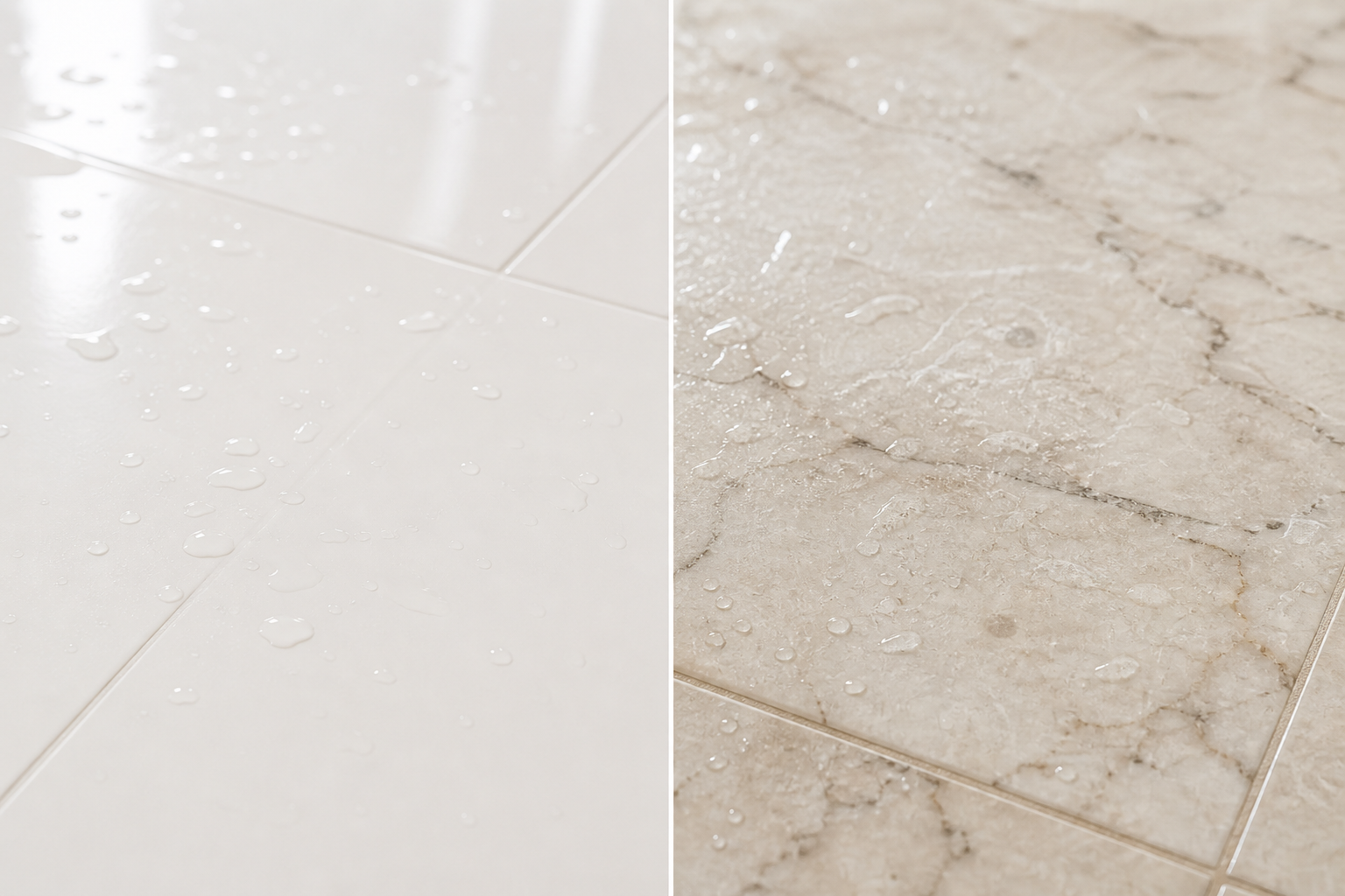
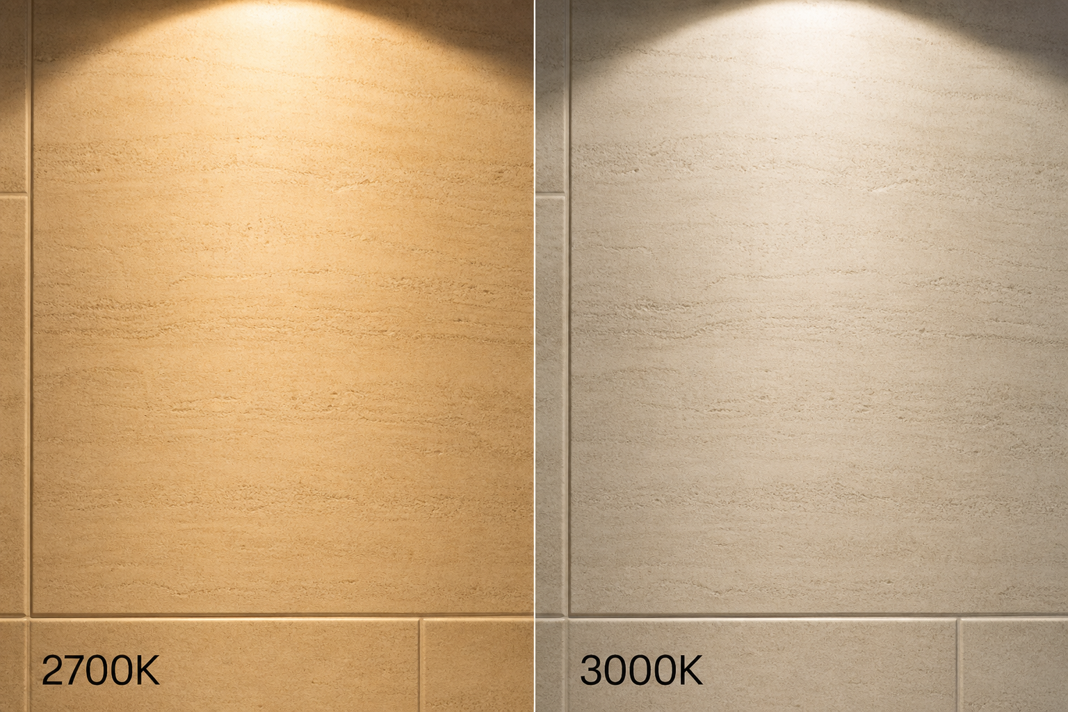
This is not a preference question. It is a physics question with design consequences. Light sources are described in Kelvin: lower numbers read warm and amber, higher numbers read cool and blue-white. The same porcelain tile that reads creamy and soft under three thousand Kelvin can read gray and flat under four thousand. The same warm white paint can look pink under twenty-seven hundred or greenish under thirty-five hundred if the Color Rendering Index is low. The tile did not change. The light changed how your eye interprets it.
What Kelvin Actually Does in a Bathroom
Color temperature describes the hue of white light, not its brightness. Brightness is lumens. Temperature is the character of the white: candlelight around eighteen hundred Kelvin, traditional incandescent around twenty-seven hundred, soft white around three thousand, neutral white around thirty-five to four thousand, daylight around five thousand and above.
In a bathroom, that character interacts with every surface. Warm light adds amber to everything it touches. Cool light adds blue. Materials with warm undertones (beige stone, honey oak, cream tile) amplify under warm light. Materials with cool undertones (gray porcelain, blue stone, chrome) amplify under cool light. Mix the wrong temperature with the wrong material and the room looks like a color correction error, not a design.
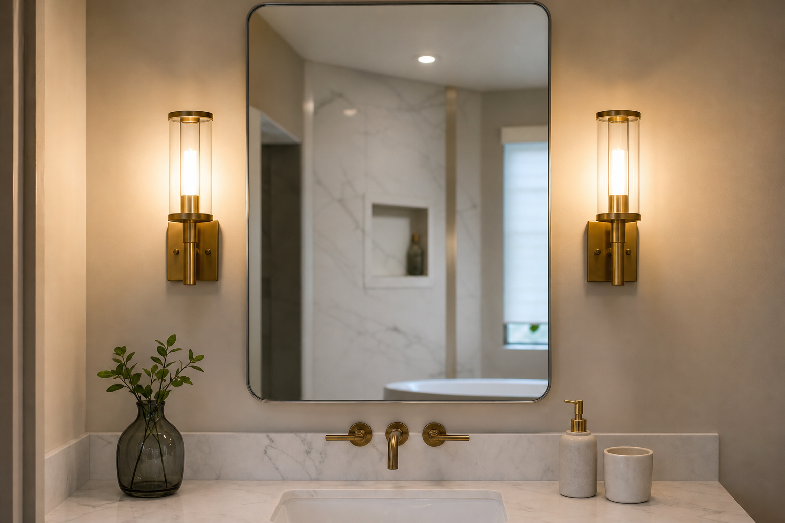
Maple Electric Supply's room-by-room guidance recommends three thousand to thirty-five hundred Kelvin for bathrooms with a Color Rendering Index of ninety or above at the vanity. That range balances accurate color perception for grooming with a warmth that does not feel clinical. The recommendation is a starting point, not a universal rule. The correct temperature for your bathroom depends on what you are trying to see accurately and what atmosphere the room should hold when nobody is standing at the mirror.
The Showroom Trap
The most common color temperature failure in bathroom renovation follows a predictable sequence. The homeowner selects tile in a showroom lit at four thousand Kelvin or higher because showrooms prioritize clarity and product display. The tile looks crisp. The veining reads clearly. The gray undertone feels sophisticated.
At home, the electrician installs twenty-seven hundred Kelvin recessed cans because the homeowner wanted a "warm, relaxing" bathroom. The tile arrives. It looks muddy, darker, or unexpectedly beige. The homeowner concludes they chose the wrong tile. They did not. They chose tile under one light and installed another.
The mechanism is metamerism: colors match under one light source and diverge under another because the spectral content of the sources differs. Tile showrooms know this. Many homeowners do not, and the gap produces expensive regret.
The fix is sequencing. Decide the color temperature specification first. View all material samples under that temperature. If the sample will live primarily at the vanity, view it there. If it will cover the floor, view it under the ambient light that will illuminate the floor at six a.m. The sample that looked perfect under showroom daylight may be the wrong sample under the light you will actually live with.
Does the Bathroom Have to Be One Temperature?
No. But the transitions must be deliberate.
A single bathroom often serves two incompatible lighting needs. Grooming requires accurate color rendering at the face. Bathing at night requires warmth and low intensity that does not trigger alertness. A ceiling full of four thousand Kelvin downlights serves grooming and ruins the evening bath. A room full of twenty-seven hundred Kelvin sconces serves atmosphere and misleads anyone applying makeup.
The practical solution is zoning with a consistent vocabulary. Many designers specify three thousand Kelvin as the baseline ambient temperature for the room, with the same temperature or slightly cooler at the vanity for task accuracy. Others use three thousand at the vanity and twenty-seven hundred at the bath, accepting that the mirror zone is for tasks and the tub zone is for rest. What fails is accidental mixing: one four thousand Kelvin bulb in a room otherwise lit at twenty-seven hundred reads as a mistake from the doorway, not as intentional layering.
Maple Electric Supply's mixing rules apply directly: one temperature per visible zone, transitions that shift gradually rather than abruptly, and matched brands within a room because two "three thousand Kelvin" bulbs from different manufacturers can render differently. CCT-selectable fixtures help because the temperature is set at installation and documented for future replacement.
Warm-dim products add another option. Some LED fixtures shift warmer as they dim, mimicking incandescent behavior. A vanity light at full brightness might sit at three thousand Kelvin for grooming. Dimmed for a late-night visit, it drifts toward eighteen hundred. The room changes character without changing bulbs.
CRI Matters as Much as Kelvin
Two fixtures at the same Kelvin rating can make the same tile look different if their Color Rendering Index differs. CRI measures how accurately a light source renders colors compared to natural daylight, on a scale of zero to one hundred. Builder-grade LED often sits around eighty. For bathrooms, where skin tone, makeup, hair color, and material selection all depend on accurate perception, ninety or above is the defensible specification.
Low CRI produces muddy, distorted color regardless of Kelvin. Warm light with poor CRI makes everything look dingy. Cool light with poor CRI makes skin look gray. Homeowners blame the tile, the paint, or the mirror. The light source is the variable they never examined.
When specifying bathroom lighting, Kelvin and CRI are a pair. Write both on the plan. "Three thousand Kelvin, CRI ninety-plus" at the vanity is a complete specification. "Warm white LED" is not.
Temperature by Material
Different materials respond differently to color temperature, and the response should inform the specification.
Warm-toned materials (travertine, limestone, honey oak, cream porcelain, unlacquered brass) generally look best under twenty-seven hundred to three thousand Kelvin. Cooler light drains the warmth from these surfaces and can make them look gray or lifeless.
Cool-toned materials (gray porcelain, slate, stainless fixtures, blue-gray paint) can tolerate and sometimes prefer slightly cooler light, three thousand to thirty-five hundred Kelvin, without losing their character. Pure white marble and bright white tile often read cleaner at three thousand to thirty-five hundred than at twenty-seven hundred, where they can pick up amber and look yellowed.
Mixed palettes require a decision about which material leads. If the floor is warm limestone and the vanity is cool gray, the lighting will favor one undertone over the other. Taste determines which material should read truest. Usually that is the surface at face height, where skin tone accuracy matters most.
Skin tone is itself a material in the room. Twenty-seven hundred Kelvin at the vanity flatters some complexions and misleads others. Three thousand is the most common compromise. Four thousand and above tends to magnify redness and texture in ways that feel harsh for daily grooming. The NKBA and multiple lighting guides recommend avoiding extremes at the mirror: below twenty-seven hundred for task work, above four thousand for residential bathrooms.
Natural Light Complicates the Calculation
Bathrooms with significant daylight add another variable. North-facing windows in the Pacific Northwest deliver cool, gray light much of the year. A room that relies on warm artificial light may need slightly warmer artificial specification to compensate when daylight is absent or cool. South-facing light adds warmth that artificial sources must not fight.
The specification should account for the season and time when the room is most used. A primary bath used primarily at six a.m. in winter has different lighting needs than a powder room visited briefly in the evening. The six a.m. room needs artificial light that completes what daylight cannot provide. The powder room may need only enough warmth to feel welcoming, with less demand for grooming accuracy.
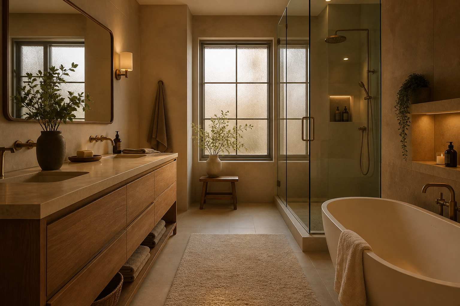
Layering helps. Dimmable ambient light at the room's baseline temperature, fixed task light at the mirror, and optional accent light at the bath give the household control without requiring a single temperature to serve every scenario.
The Specification Belongs on the Plan
Color temperature should appear on the design drawing alongside fixture locations, not in a conversation after tile is ordered. The specification includes Kelvin, CRI, fixture type, and dimming behavior where applicable. It notes which zones share a temperature and which deliberately differ.
Contractors and electricians default to whatever is in stock or whatever the homeowner mentions once. "Warm light" is not a specification. "Three thousand Kelvin, ninety CRI, dimmable, matched manufacturer across all vanity sconces" is.
Material selection follows the specification. Samples are viewed under a portable fixture or in a room set to the specified temperature. The decision is made with the light the room will have, not the light the showroom has.
We specify color temperature in the design drawing before any tile samples are reviewed. Clients bring samples to our project space at the specified temperature, not the showroom's light.