There is a particular kind of disappointment that only an expensive renovation can produce. The invoices are real. The stone is real. The faucet brand is real. And still, when the bathroom is finished, something feels off.
Not ugly. Not disastrous. Just not convincing.
This is the difference between a bathroom that costs a lot and a bathroom that looks expensive. The first is a receipt. The second is a composition. Money can buy better materials, but it cannot automatically make those materials agree with one another. That agreement is where taste lives.
The useful question is not "what makes a bathroom look rich?" That question leads people toward louder stone, bigger mirrors, heavier hardware, and fixtures that announce themselves. The better question is: what makes a bathroom feel resolved?
Resolved rooms look expensive because the decisions inside them seem inevitable. Nothing is shouting for attention. Nothing feels leftover. The light, scale, materials, storage, plumbing, and edges are all moving in the same direction.
That is not about spending less. It is about spending in the right order.
Expensive Materials Can Still Create A Cheap Room
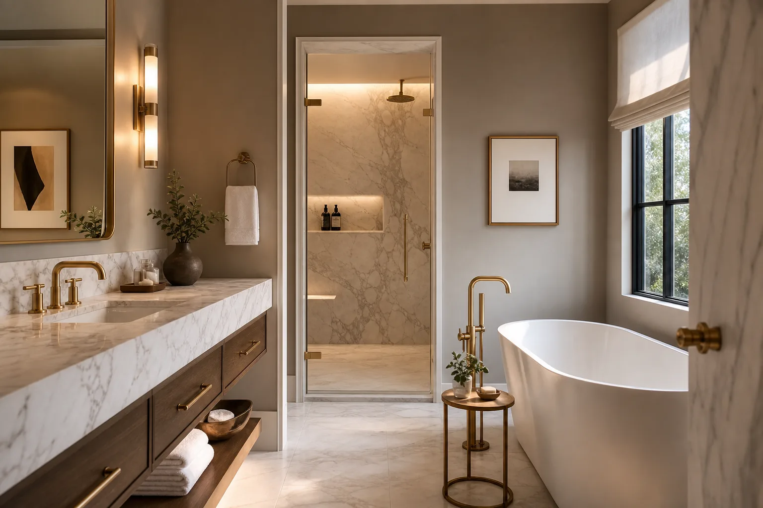
The easiest mistake is believing that each expensive object improves the room on its own. A premium faucet. A slab shower wall. A freestanding tub. A custom vanity. A backlit mirror. Heated floors. Imported tile. The list looks impressive, and on a bid it may look like proof of quality.
But a bathroom is not a catalog spread. It is a small room with water, steam, reflection, hard surfaces, and daily routine. Every additional statement piece has to share air with every other statement piece. When too many objects ask to be the reason the room matters, the room starts to feel insecure.
This is why some costly bathrooms feel oddly cheap. They are not underfunded. They are over-explained.
The eye has nowhere to rest. The veining in the slab fights the grain of the vanity. The brass finish warms the room, but the lighting turns it green. The tile is large enough to be impressive but cut awkwardly around a niche. The mirror is expensive but scaled for a hotel lobby rather than the wall it sits on. The room has many purchases and no hierarchy.
Hierarchy is the invisible structure that tells the eye what matters first, second, and third. Without it, cost becomes noise.
The First Marker: Proportion
Proportion is the reason two bathrooms with similar materials can feel completely different. A vanity can be technically correct and visually heavy. A mirror can be large but still wrong. A shower glass panel can be clean but break the line of the room. A tile can be beautiful in a sample and awkward once it has to wrap a real corner.
People often describe this as instinct: "something feels off." But the feeling usually has a reason. The vanity is too tall for the mirror placement. The sconce is too close to the edge. The niche lands half a tile too low. The showerhead is centered on the drain but not on the person using it. The toilet is visible from the doorway in a way that makes the whole room feel less considered.
Expensive-looking bathrooms are not perfect because perfection is impossible in remodeling. They are convincing because the compromises were handled intentionally.
One useful test: if you removed the premium finishes and rendered the bathroom in plain white boxes, would the proportions still work? If the answer is no, the room is leaning on materials to solve a design problem materials cannot solve.
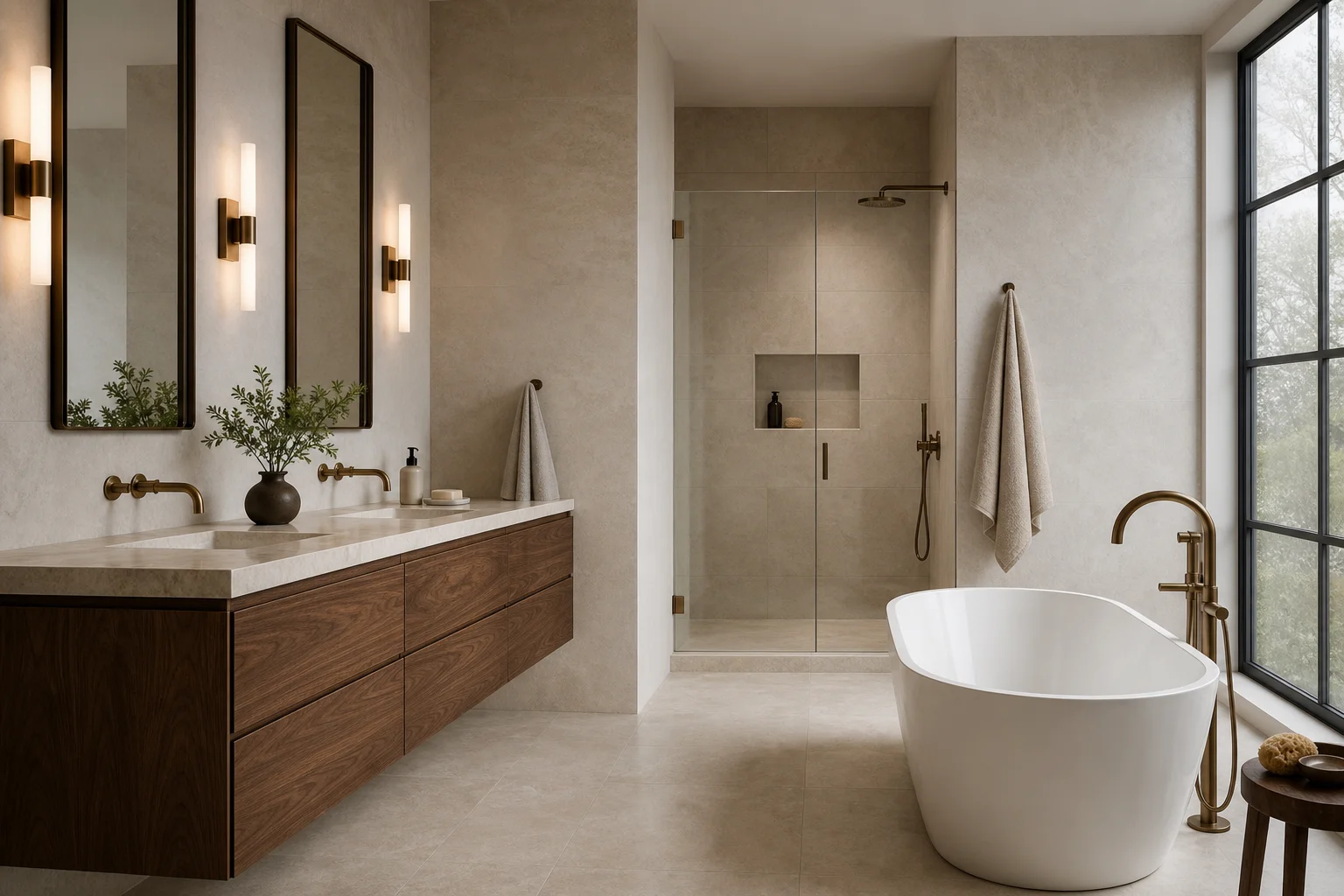
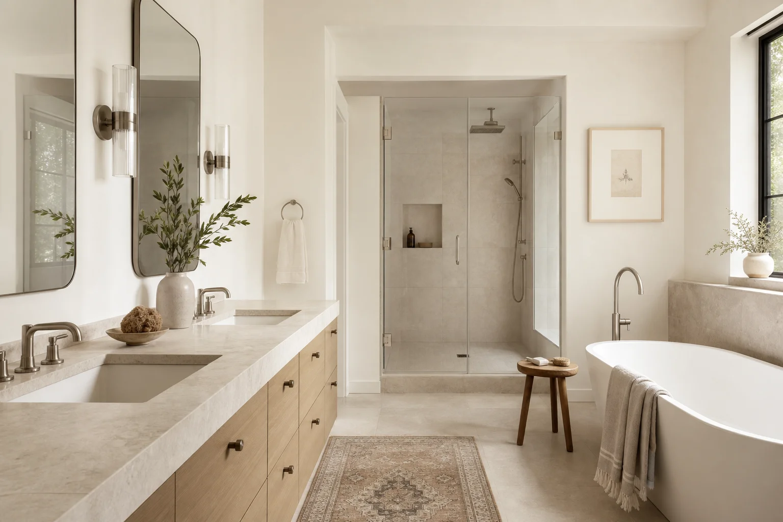
The Second Marker: Fewer Materials, Better Chosen
A refined bathroom usually has fewer materials than people expect. That does not mean bland. It means the materials have a clear relationship.
Think in families rather than products:
- One dominant field material
- One supporting texture or tone
- One metal language
- One wood or cabinet language
- One counter surface that bridges rather than competes
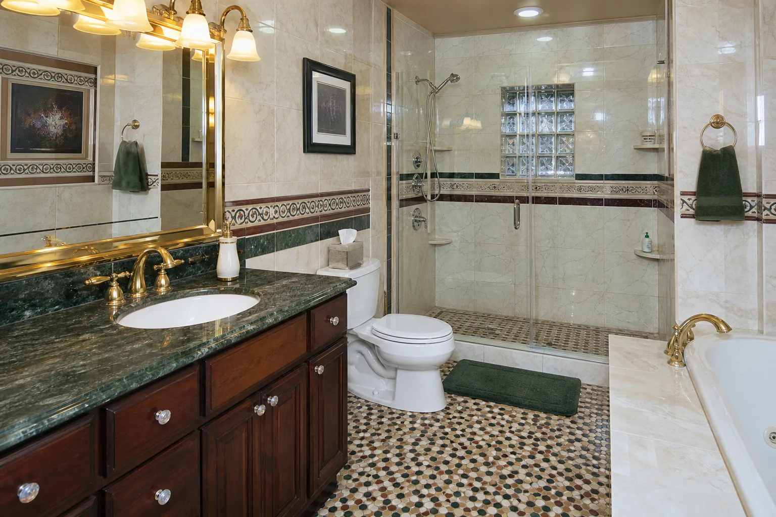
The danger is not variety. The danger is unrelated variety. A warm stone, cool gray tile, glossy white vanity, matte black hardware, brass lighting, and patterned floor can all be individually defensible. Together, they may read as a renovation assembled from separate shopping trips.
The best bathrooms often have one decisive move and several quiet ones. A stone with movement asks for simpler neighbors. A handmade tile asks for restraint elsewhere. A strong floor pattern asks the walls to behave. The expensive room is the room where the supporting cast knows it is supporting.
This is where taste becomes ethical in a small way. You are not trying to impress a stranger. You are trying to make a room that will still feel honest after the novelty wears off.
The Third Marker: Light That Tells The Truth
Bad lighting can make excellent materials look suspicious.
Blue-white light can turn warm stone chalky. A single overhead fixture can cast shadows under the eyes and make the vanity feel hostile. Mirror lighting placed too high can flatten the face. Decorative sconces can look wonderful in photographs and fail at the job of grooming. A dim bathroom can feel expensive for five minutes and irritating every morning.
The expensive-looking bathroom has layered light. It has task light at the mirror, ambient light for the room, shower light where needed, and some way to soften the room at night. The color temperature and color rendering are chosen because the materials and the human face both deserve honest light.
This is one of the cheapest places to ruin an expensive room. It is also one of the most effective places to make a restrained room feel considered.
The lesson is simple: a bathroom does not look expensive because the light fixture was expensive. It looks expensive because the light behaves well.
When we develop a finish palette for a primary bathroom, we build a hierarchy before we name specific products: primary surface, secondary surface, accent. Then the light source position relative to those materials. Then grout joint width relative to tile format. These sequencing decisions are part of our design process because they determine how selections interact with each other, not just how each one looks in isolation on a sample board.
The Fourth Marker: Edges And Transitions
Expensive rooms reveal themselves at the edges.
Where does the tile stop? How does the shower glass meet the curb or floor? Does the vanity meet the wall cleanly? Are the outlets placed with any respect for the mirror? Does the stone die into a painted edge, a metal profile, or a return? Are the grout lines planned around the niche, or did the niche get placed after the tile pattern was already doomed?
These questions are not fussy. They are where the room's intelligence becomes visible.
Most homeowners are trained to shop the center of things: the main tile, the faucet, the tub. Contractors and designers should be thinking about the edges, because the edges decide whether the expensive choices look integrated. A room with modest materials and excellent transitions can feel more expensive than a room with premium materials and careless stops.
This is one reason the cheapest-looking bathrooms often have one recurring trait: they feel like they were solved one surface at a time.
The Fifth Marker: Hidden Practicality
The more a bathroom has to explain its practicality, the less refined it feels. The robe hook added later. The towel bar squeezed behind the door. The outlet that requires a cord to cross the counter. The shower niche that cannot hold the shampoo the family actually uses. The drawer that hits the plumbing trap. The heated floor control placed where nobody naturally reaches.
These are not small failures to the person living in the room. They are daily reminders that the design cared more about the photograph than the routine.
An expensive-looking bathroom does not hide function by ignoring it. It hides function by resolving it early. Storage is designed before the vanity is ordered. Towels have a home before glass is templated. Outlets are placed before the mirror is chosen. The shower sequence is imagined before rough plumbing.
That is why the room feels calm. Not because nothing is happening, but because the work has already happened.
What To Spend On First
If the goal is a bathroom that reads as expensive without becoming theatrical, spend first on:
- Layout that improves daily use
- Waterproofing and ventilation
- Lighting quality and control
- Tile layout planning
- Proper substrate preparation
- Fewer, better-coordinated materials
- Cabinetry that fits the routine
- Skilled labor at the edges and transitions
Then spend on the visible upgrades that actually support the plan.
This order is not glamorous. It is also the difference between a room that looks expensive and a room that merely documents expensive decisions.
The Real Test
The test is not whether the bathroom impresses you the first time you see it finished. New rooms usually impress for a while. The test is whether the room becomes easier to love as the novelty fades.
Do the materials still make sense together on a gray morning? Does the light still feel kind? Does the shower still drain correctly? Does the vanity still serve the way you get ready? Does the room feel like it belongs to the house rather than to a design trend from the year it was built?
That is the quiet achievement. A room that does not need to keep proving what it cost.