Personality in a bathroom is not decoration. It is specificity about how a household actually lives: their height, their morning rhythm, their materials, their light. A bathroom built for a specific person cannot read as trendy because it is not borrowed from a trend board. It is built from answers to questions that have nothing to do with what is popular this year.
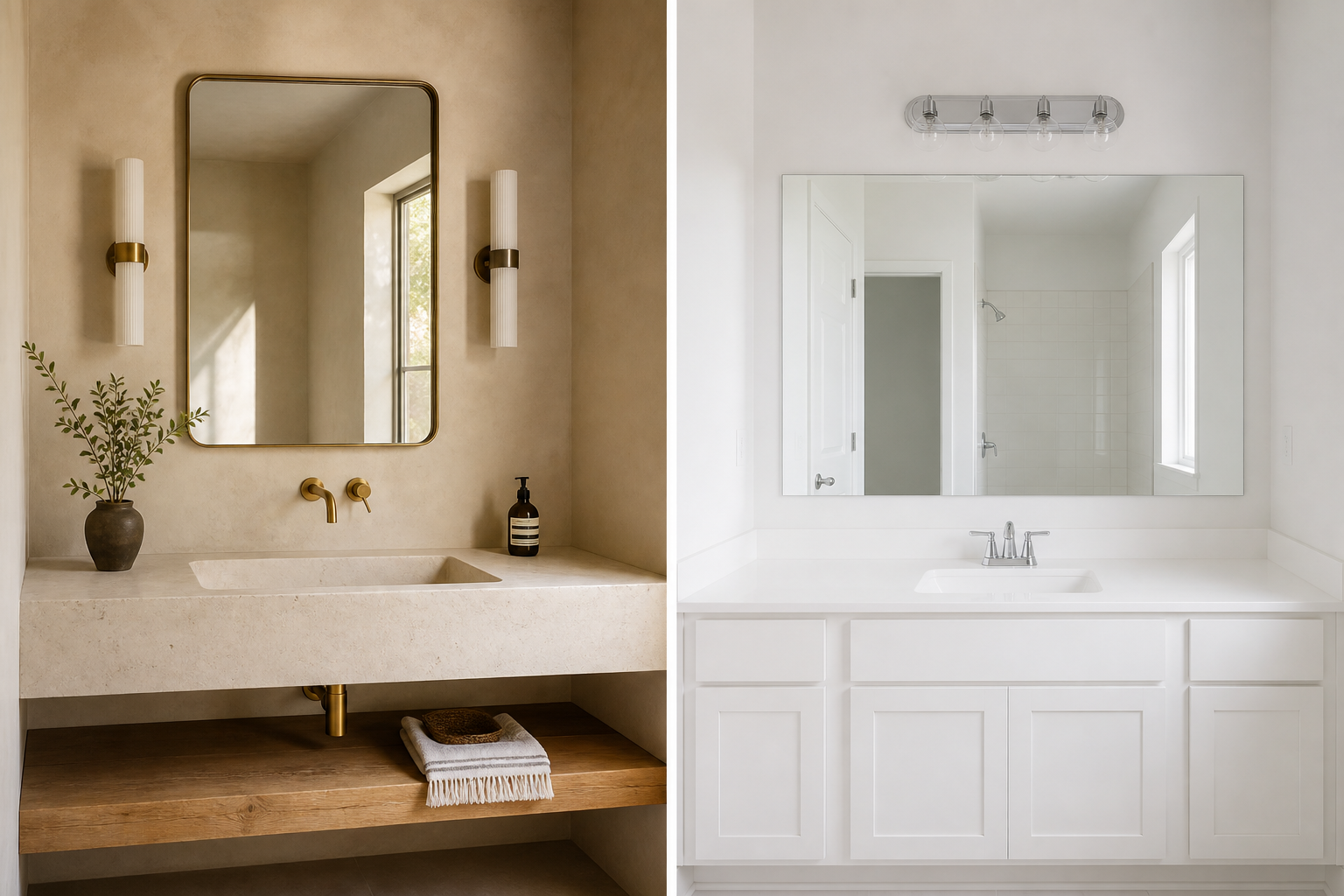
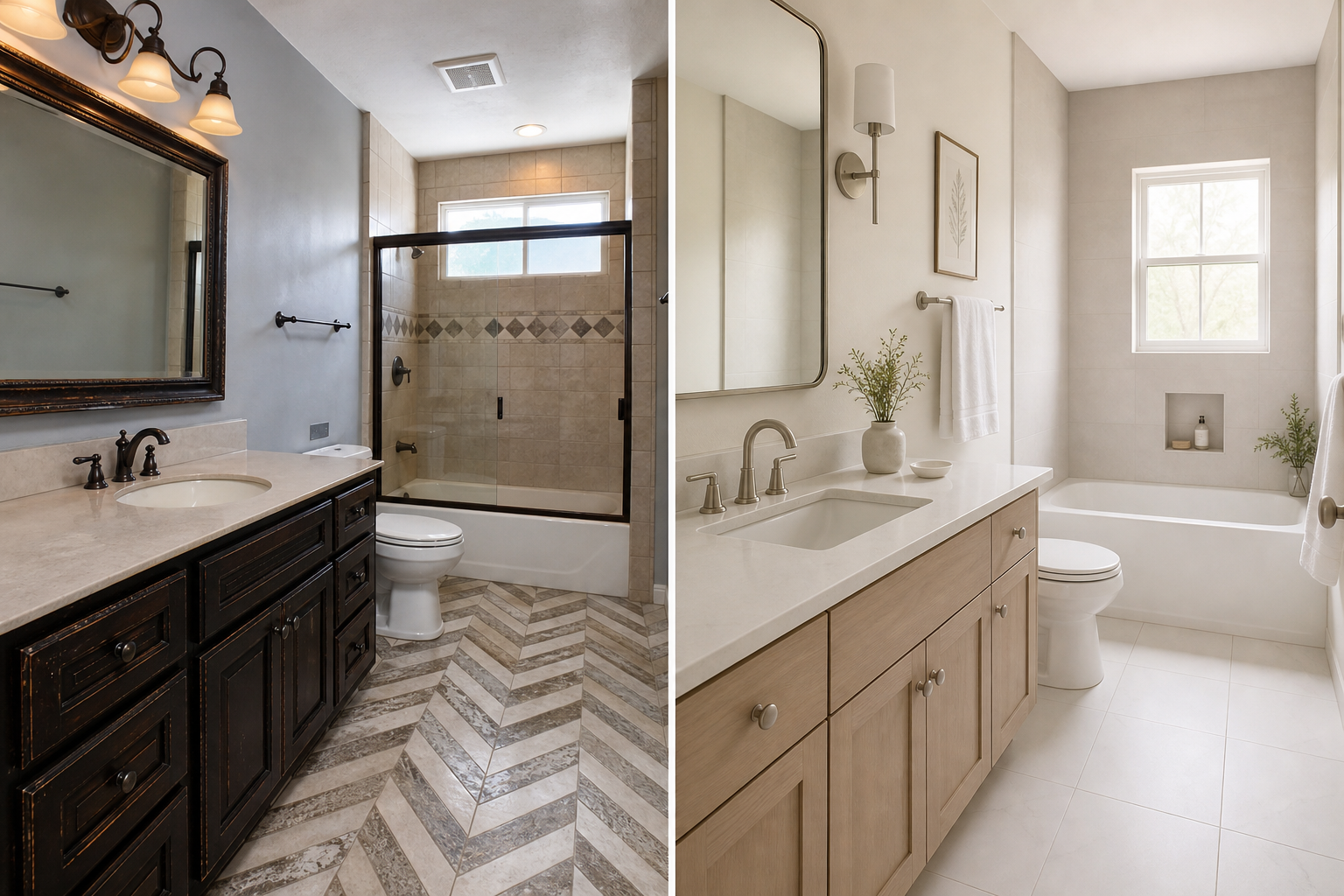
That distinction sounds abstract until you walk into a bathroom that got it wrong. The room has a brass faucet because brass was everywhere on Instagram. The zellige tile because every design account featured it. The floating vanity because open space reads as modern. Each choice is defensible in isolation. Together they feel assembled, not inhabited. The personality is borrowed. The room speaks in a voice that is not the household's.
The alternative is not safe neutrality. It is not beige tile and chrome hardware chosen to avoid commitment. It is a room where the visible choices trace back to how real bodies move through real mornings. That kind of specificity cannot date because it was never trying to be of-the-moment. It was trying to be correct for one household.
Why Trend Boards Fail as Personality
A trend board is a curatorial exercise. Someone with good visual judgment selects images that share a mood, a palette, a material vocabulary. The board is coherent. It is also generic. It describes a type of person, not a person.
When a homeowner builds a bathroom from a board, they are importing a vocabulary. Brass-and-travertine. Black fixtures on white tile. Curbless wet room with a freestanding tub nobody uses. The vocabulary has a name this year. Next year it will have a different name and a slightly different palette. The bathroom, once installed, cannot rename itself.
The mechanism of trend failure is not that the materials are bad. Brass is a fine finish. Zellige is a legitimate tile format. The failure is that the choices were selected for their reference value rather than their fit. A brass faucet chosen because brass is having a moment will feel dated when brass recedes. A brass faucet chosen because the household's existing hardware is unlacquered brass and they want continuity will feel intentional regardless of what Instagram prefers.
Personality that lasts comes from fit, not from reference. Fit is the judgment that a material, proportion, or layout serves this room, these bodies, this light. Reference is the judgment that a material appears on enough curated images to feel current. The two look identical in a showroom. They diverge within a few years of daily use.
Specificity Starts With the Body, Not the Palette
The most personal decisions in a bathroom rarely appear on a mood board because they are too mundane to photograph well.
Vanity height is personal. A household where one person is six-foot-two and another is five-foot-three needs a compromise or a double vanity at different heights. The standard thirty-six-inch vanity serves neither person optimally. A room built for both will feel different from a room built for the catalog average, and that difference is personality.
Shower control placement is personal. A person who shaves in the shower needs the handheld within reach before the water is on. A person who washes hair at the sink needs a mirror light that renders color accurately at face level, not a decorative pendant that flatters the room and misleads the face.
Storage is personal. A household that keeps six product bottles in the shower needs a niche deep enough for six bottles, not the shallow recess that looks clean in a staged photo. A household that air-dries hair every morning needs an outlet in the right location and a surface that tolerates heat and moisture.
These decisions do not trend. They do not untrend. They either fit the household or they do not. When they fit, the room feels inhabited from the first week. When they do not, the room feels like a hotel that expected a different guest.
Materials Become Personal When the Reason Is Yours
Material choice is where personality is most often confused with trend adoption. The mechanism that separates the two is simple: can the homeowner explain why this material, in this room, for this use, without referencing what they saw online?
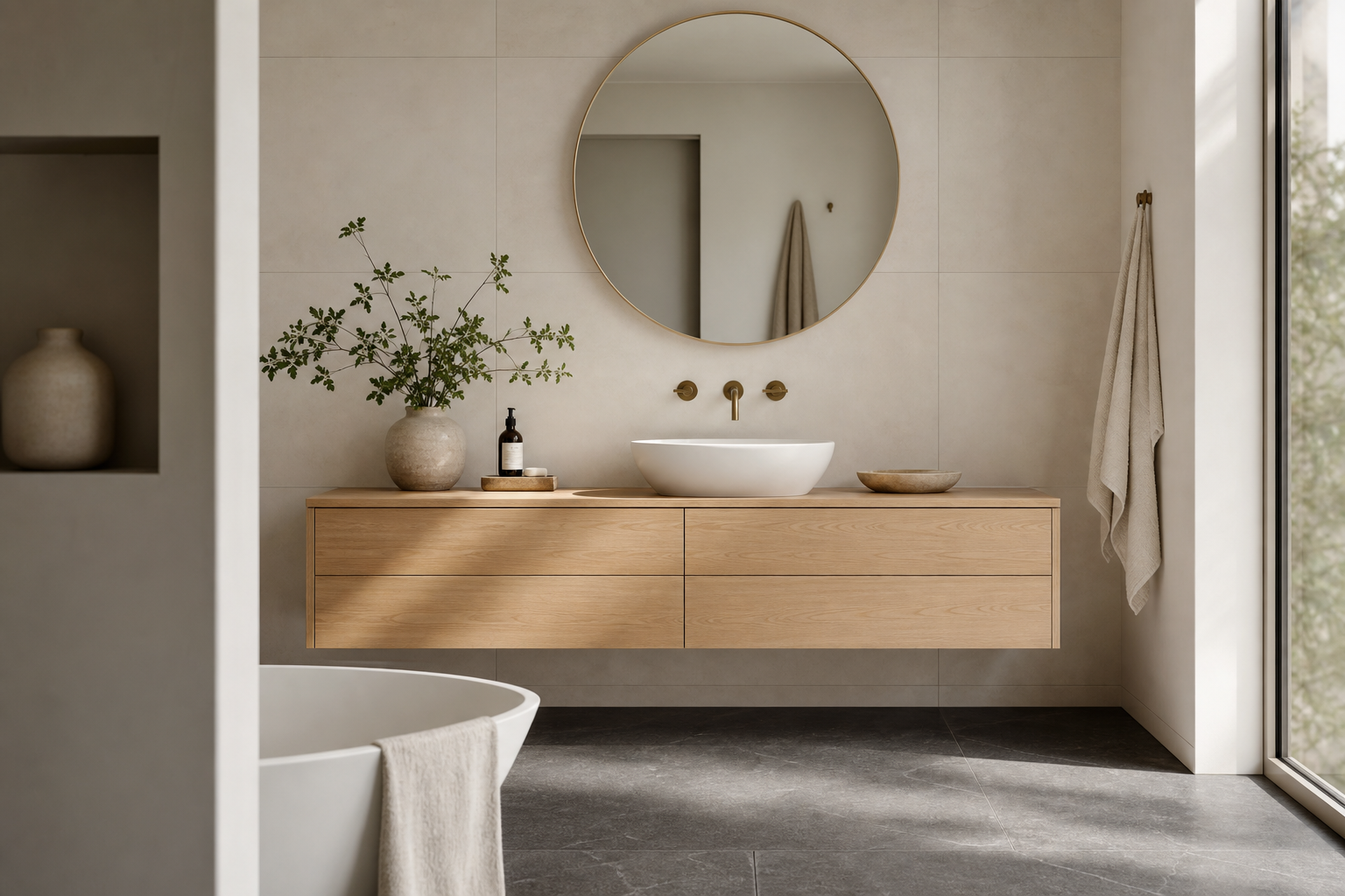
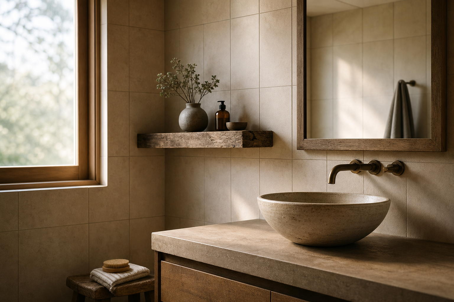
A handmade ceramic vessel sink is personal when the homeowner chose it because they wanted a soft form that contrasted with rectilinear tile they already loved. It is trendy when they chose it because vessel sinks appeared on twelve boards they saved.
Reclaimed oak on a vanity is personal when the wood came from a family barn or when the warm grain responds to the particular gray light that enters the room at seven in the morning. It is trendy when oak was declared the counter-trend to white minimalism and the homeowner wanted something that felt "warm" without examining what warmth means in their specific room.
Terrazzo reads as personal when the aggregate colors were selected to relate to stone already in the house. It reads as trendy when terrazzo was simply the floor material of the year and the decision stopped there.
The material is rarely the problem. The absence of a reason is the problem. Trends supply reasons that feel like reasons: "It is current." "It photographs well." "My designer suggested it." None of those reasons survive contact with a Tuesday morning when the room must function.
Light Is Personality Most People Skip
Lighting is often treated as a technical afterthought: enough lumens, code-compliant, done. That approach produces rooms that are adequately bright and entirely generic.
Light becomes personal when it is calibrated to how the room is actually used and who is using it. A household where both people prepare for work in the same twenty-minute window needs task lighting at the mirror that renders skin and clothing color accurately, not ambient lighting that flatters the room and misleads the face. A household where one person reads in the bath at night needs a dim, warm source that does not trigger alertness. A household with a north-facing window and long gray winters needs artificial light that compensates for the absence of warm daylight, not light that mimics a showroom's color temperature.
Color temperature is a specification with consequences. Three thousand Kelvin and twenty-seven hundred Kelvin render the same tile differently. The same paint reads warmer or cooler. The same skin tone looks healthy or sallow. Choosing light without considering the materials it will reveal is one of the fastest ways to produce a room that feels wrong despite expensive finishes.
Personality in light is not a dramatic fixture. It is the decision to place sconces at eye level rather than overhead because the household cares about how they look before they leave the house. It is the decision to put the bath light on a dimmer because someone soaks at ten p.m. and does not want to feel like they are in a clinic. These are small specifications. They are also unmistakably about a specific life.
Restraint Is Not the Opposite of Personality
There is a version of bathroom design advice that treats personality as something you add at the end: neutral foundation, then "pop" with accessories. That model produces rooms that are easy to update and hard to love. The accessories change. The foundation remains generic.
Restraint and personality are not opposites. Restraint is the discipline of removing choices that do not serve the household so that the choices that remain can be seen clearly. A room with one strong material decision and quiet supporting surfaces often feels more personal than a room with six competing statements. The strong decision has room to breathe. It reads as conviction rather than accumulation.
The NKBA bath planning guidelines emphasize functional planning before finish selection for a reason. A room that works well for the bodies that use it will tolerate a narrower palette. A room that works poorly will not be saved by interesting tile.
Personality does not require maximalism. It requires that whatever is present be there for a reason that connects to the household. One shelf at the exact height where a tall person reaches for a towel. One window treatment that admits morning light without sacrificing privacy at the property line. One tile pattern that continues a geometry already present in the house. Each is a single move. Each is specific. None requires a trend board.
The Trend Test
Before committing to a visible choice, ask one question: if this material or finish were no longer popular, would I still want it for reasons that have nothing to do with popularity?
If the answer is yes because the color relates to the stone on the fireplace hearth, or because the proportion fits the room's ceiling height, or because the texture feels right under bare feet on a cold morning, the choice is personal. It may happen to be current. That is incidental.
If the answer is no, or if the reason is "I saw it everywhere and loved how it looked in photos," the choice is borrowed. Borrowed choices are not always mistakes. They are always temporary. The room will read as a moment in design history rather than as a room that belongs to a household.
There is a secondary test for households renovating with resale in mind. Personality and market appeal are not enemies. A bathroom with clear convictions often shows better than a bathroom with no convictions at all. Buyers may not share the household's taste. They recognize when a room was designed with care and specificity. They also recognize when a room was assembled from whatever was trending the year the remodel started. The first reads as quality. The second reads as a timestamp.
What Personality Looks Like in Practice
A bathroom with personality might have almost no visible drama. It might be quiet tile, simple fixtures, and one unusual detail that only makes sense once you know the household.
The detail might be a niche positioned for a specific person's reach. A mirror sized for two people who actually stand side by side. A heated floor because someone in the house has circulation that makes cold tile painful, not because heated floors are a luxury signifier. A window placed to catch afternoon light on a particular wall because someone reads there. A bench in the shower because a knee injury three years ago made standing through a long shower impractical.
None of these choices require bold color or unusual materials. All of them require paying attention to a specific life. That attention is the whole difference between a room that feels trendy and a room that feels like home.
The bathrooms that age best in our experience are not the ones that avoided every trend. They are the ones where every visible choice can be traced to a question about daily life. The tile is there because it works with the light and the maintenance tolerance of the household. The vanity height is there because of who stands at it. The storage is there because of what people actually own and reach for. The room tells a story. The story happens to be true.
We ask about daily rituals before recommending anything visual. What time does each person use this room, in what light, for how long. Those answers produce a room that belongs to the household.