The number of materials in a bathroom is not the measure. The hierarchy is. A room with six materials that has a clear primary, secondary, and accent structure can read as calm and considered. A room with three materials that all compete for dominance reads as restless. The question is not "how many?" but "which one is in charge, and does everything else serve it?"
This runs against the advice most homeowners encounter, which usually takes the form of a number. Three materials is the rule. Limit yourself to three tiles. Stay under five finishes. The number is not wrong exactly. It is just treating the symptom rather than the disease. The reason rooms with too many materials feel unsettled is not that the count crossed a threshold. It is that nobody established which material leads, which supports, and which accents. Add more materials without resolving that question and you compound the problem. Reduce the count without resolving it and you still end up with a restless room, just one with fewer options.
Understanding why this happens, and what hierarchy actually means in practice, is more useful than any number.
What Visual Competition Looks Like and Why It Feels Wrong
When two materials occupy similar surface areas in the same visual field and have similar visual weight, the eye cannot decide which to follow. It moves between them continuously, looking for a cue about where to settle and finding none. This is not a poetic description of aesthetic discomfort. It is a description of how visual processing actually works.
The human visual system searches for hierarchy automatically. It assigns priority based on contrast, scale, texture, and position. When a room has clear hierarchy, the eye finds the dominant element quickly, recognizes that secondary elements are supporting it, and settles. The room feels calm because the visual system has resolved its search and stopped working.
When a room lacks hierarchy, the search does not resolve. Every material at similar visual weight sends an "attend to me" signal. The eye oscillates. The room feels busy or restless not because it contains too many things but because it contains too many things at the same level of visual importance.
This is why a well-composed room can include six or seven materials and still feel serene. The hierarchy is so clearly established that the eye finds the primary element immediately, reads the secondary materials as background, and processes the accent material as a deliberate punctuation. The count never becomes the issue because the ranking was settled first.
And it is why a poorly composed room can feel crowded with three materials. A warm-toned tile floor, a competing warm-toned wood vanity, and a warm-toned stone countertop, all in similar tonal ranges and similar proportions, have nothing to separate them into a hierarchy. The eye moves around the room looking for a winner and finds none. The room feels unresolved even though nothing in it is ugly or wrong on its own.
The Mechanism: Primary, Secondary, Accent
Visual hierarchy in a material palette has three levels. Each has a job, and the jobs are different enough that mixing them up breaks the system.
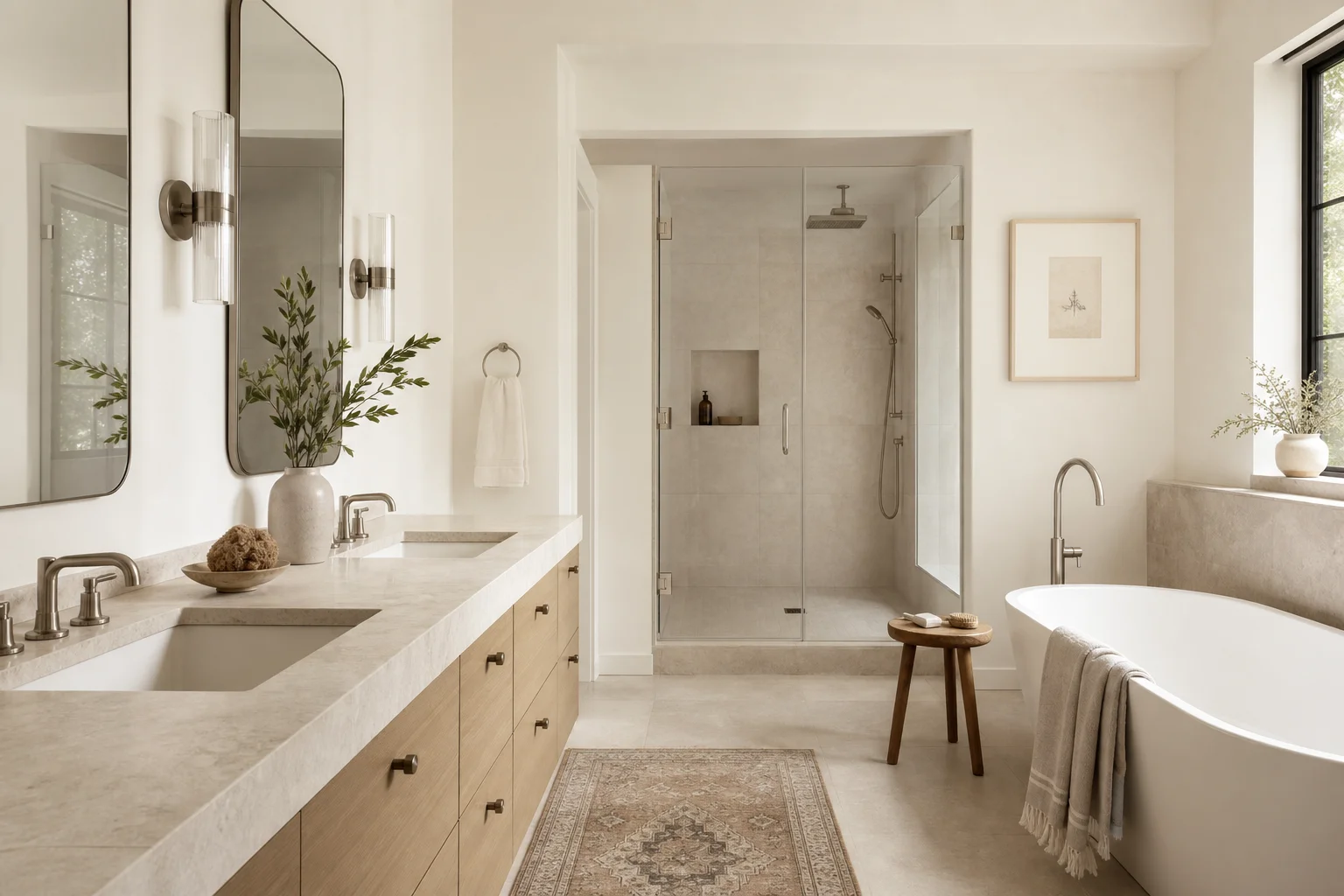
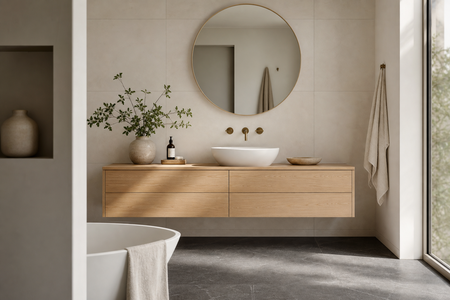
The primary material is the dominant surface. It covers the largest area. It is the first thing the eye reads when entering the room. In a bathroom, the primary material is almost always the field tile: the floor, the shower wall, or the main wall surface. The primary material sets the room's temperature, tone, and character. Everything else is in conversation with it. This material needs to be able to fill a large plane without becoming fatiguing. That usually means restraint: a large format with a subtle surface variation, a stone with directional movement rather than chaotic veining, a plaster with a consistent texture.
The secondary material complements and grounds the primary. It typically appears at accent surfaces, the vanity, a feature wall opposite the shower, the tub surround. It has less area than the primary and different visual weight, either lighter or darker, smoother or rougher, warmer or cooler. The job of the secondary material is to make the primary look better by contrast. It does this quietly, without competing. If the primary tile is a warm matte limestone, the secondary might be a dark-stained oak vanity or a cool gray plaster. They are different enough to create depth; similar enough in value or texture to feel considered rather than accidental.
The accent material has the smallest footprint and is allowed the highest visual interest. Mosaic tile in a niche. A veined stone insert in a shower bench. A fluted plaster panel behind the mirror. The accent works because it is surrounded by the restraint of the primary and secondary materials. Place it everywhere and it becomes a primary material competing for dominance. Restrict it to a single well-chosen location and it reads as an intentional decision rather than a pattern that got out of hand.
The three-material "rule" that circulates in design conversations is probably a useful proxy for this hierarchy, because three materials forces a rough sorting: one will naturally become primary, one secondary, one accent. But it is a proxy for the underlying mechanism, not the mechanism itself. You can use three materials and still have hierarchy problems if all three compete for dominance. You can use six materials and have no hierarchy problems if five of them are clearly subordinate to one.
How Grout Becomes a Material
Most people do not think of grout as a design material. They think of it as the filler between the tiles they chose. This is a significant oversight.
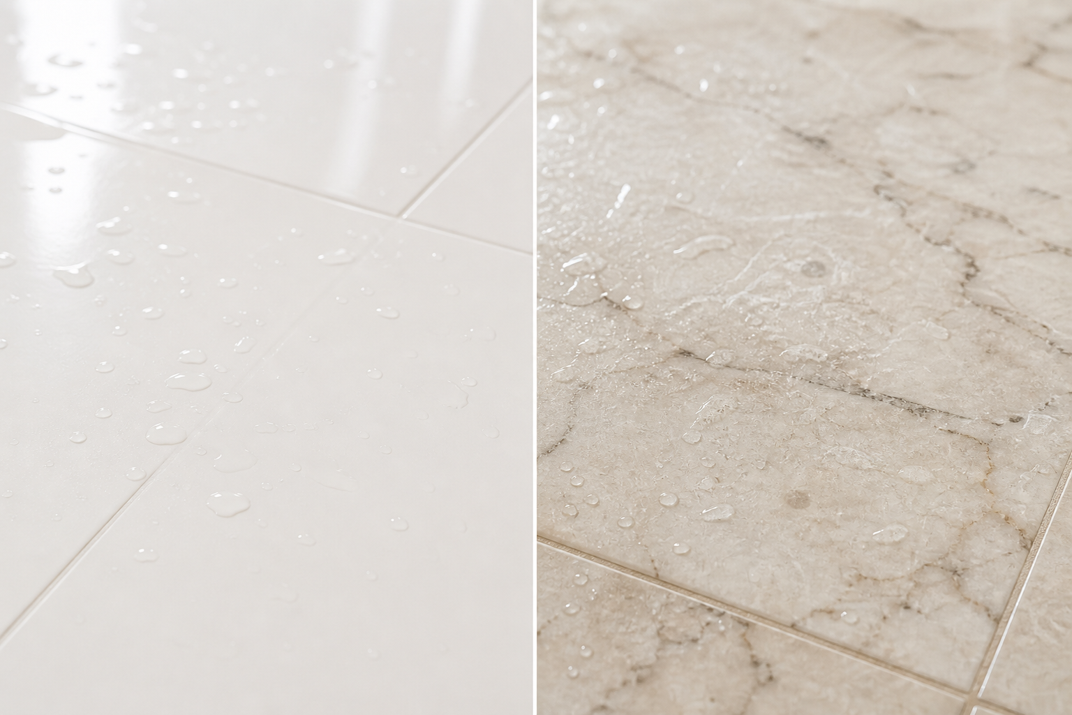
In a tiled surface, the grout joint is not invisible. It is a line, and in a field of tile that line repeats constantly. A bathroom with 4-by-12 subway tile has grout lines every four inches vertically and every twelve inches horizontally. That grid is present everywhere the tile appears. At normal viewing distance, the grout pattern can read as prominently as the tile itself.
The visual weight of grout is determined by contrast. A grout that closely matches the tile in value, even if it does not precisely match the color, allows the eye to read the tiled surface as a single plane. The grout recedes. The tile registers as a continuous field, and large-format tiles with low-contrast grout can read almost like a poured surface. A grout that contrasts sharply with the tile, intentionally or not, foregrounds the grid. The tile surface becomes a pattern of squares or rectangles instead of a field, and the room reads as busier than the tile count alone would suggest.
This means that material count understates the real number of visual elements in a bathroom. A room with two tile materials and contrasting grout on both may actually present four visual elements: tile A, grout A, tile B, grout B. If grout A and grout B are different from each other, the material complexity doubles without any additional tile in the room.
Dark floors with dark grout and light walls with light grout is not an accident of taste. It is a hierarchy decision that collapses two potential four-element surfaces into two clean planes. The floor reads as floor. The wall reads as wall. The boundary between them is clear. The hierarchy of surfaces in the room remains readable.
How Lighting Changes the Material Equation
A surface does not have a fixed visual weight. It has a visual weight under specific lighting conditions. This matters because most material selections are made in conditions that are different from the installed conditions, and the discrepancy can undermine a carefully planned palette.
Matte materials absorb light. Their value is relatively stable across lighting conditions. A matte limestone tile selected under a 4,000K showroom light will look slightly warmer under the 3,000K light of an installed bathroom, but the character of the material will not change dramatically. The hierarchy relationships you established in the showroom will largely survive installation.
Reflective materials behave differently. A polished surface returns light back to the viewer. Under overhead light, it creates specular highlights wherever the fixture position coincides with the reflection angle. Under side-lit conditions, the same polished material looks different. Under soft diffuse light, it loses the metallic intensity that made it interesting in the showroom.
This matters for hierarchy because the visual weight of a reflective accent material can increase or decrease dramatically depending on the fixture positions in the room. A veined marble insert that reads as a quiet accent under flat showroom light may become the dominant element in the installed bathroom if a recessed fixture sits directly above it and creates a specular bloom across the surface. The hierarchy you planned no longer exists, because the lighting changed the weight of one element.
The reverse is also true. A textured material with strong visual interest under raking sidelight can flatten entirely under a direct overhead fixture. The depth disappears and the material looks flat and institutional. The accent that was doing important compositional work in your rendering has stopped contributing anything.
Material selections and lighting plans should be developed together, or at least reviewed together before anything is finalized. The common sequence, tile first and lighting after, produces decisions that were made without their most important variable. A room where the lighting was specified alongside the materials, with the hierarchy consciously accounted for in both, will read more correctly.
The Trade-Off: More Materials Requires More Coordination
There is an honest trade-off in this argument. Saying "hierarchy matters more than count" does not mean that adding materials is cost-free. More materials require more coordination to get right, and the cost of getting coordination wrong rises with the count.
A bathroom with three materials can achieve hierarchy through essentially brute-force simplicity. If the floor is significantly darker than the walls and the vanity is a third tone, the hierarchy almost sorts itself. The eye reads floor as ground, walls as field, vanity as object. The room may not be inspired but it will be organized.
A bathroom with six materials requires the designer to actively manage the hierarchy at every step. Every new material introduced changes the relationships of all the existing ones. The visual weight of the floor changes when you add a dark metal threshold. The character of the wall tile changes when you introduce a contrasting feature panel. Adding a material without rebalancing the hierarchy is how rooms accumulate complexity without gaining intention.
This is not an argument against complexity. It is an argument that complexity requires skill. A room with six deliberately sequenced materials, each clearly assigned to its tier of the hierarchy, can be richer and more interesting than a room with three. But the gap between "deliberately sequenced" and "six materials that ended up in the same room" is wider than most homeowners expect. The former requires someone to hold the hierarchy through every decision in the selection process. The latter happens naturally without that person.
The failure mode is specific. An installer suggests adding a mosaic liner to border the shower niche. It is available in a complementary color. It would be inexpensive to include. Nobody stops to ask what it does to the hierarchy. If the shower niche already has a stone insert that was functioning as the room's accent, adding a mosaic liner introduces a second accent-level element directly adjacent to it. Both are now competing for the position the stone was supposed to hold alone. The stone reads as busier than intended. The liner reads as superfluous. The hierarchy of the room is degraded by a $200 addition that seemed harmless in isolation.
The Rooms That Last
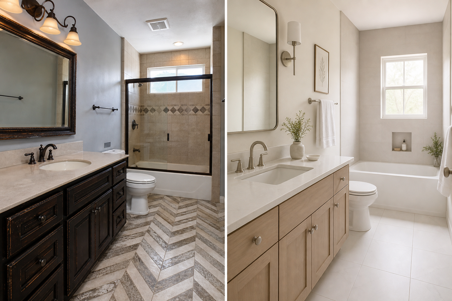
Bathrooms that age well, rooms that look as deliberate in year ten as they did on installation day, share a specific quality. Each material in them has a clear job. You can look at the floor and say: that material is the ground of this room. You can look at the vanity and say: that material is the object in this room. You can look at the shower niche and say: that material is the moment in this room. The logic is visible.
What those rooms do not have is materials that are present because they were available, because they were trending at the time of the remodel, or because nothing stopped them from being included. The subtraction decisions are as intentional as the inclusion decisions. The spaces where the primary material reads undisturbed for four uninterrupted feet feel that way because a decision was made not to interrupt them. The accent that works does so partly because everything nearby is quieter than it is.
The rooms that age poorly have a different structure. They have materials that are individually defensible but collectively unresolved. Each decision made sense in isolation. Nobody had a view of the whole.
Our typical primary bath specification uses three materials: one for the field, one for the accent surfaces, one for the countertop and vanity. Before we present options, we build the hierarchy. The client chooses within it, not before it exists.